Honour. Pride. Courage.

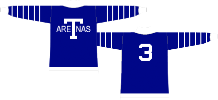
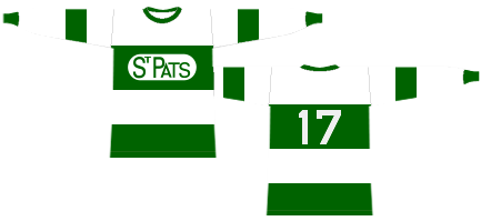
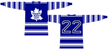
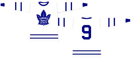
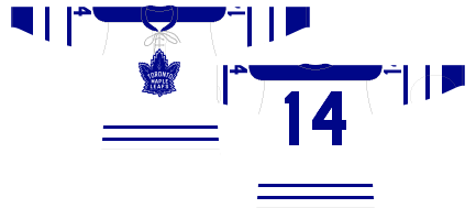
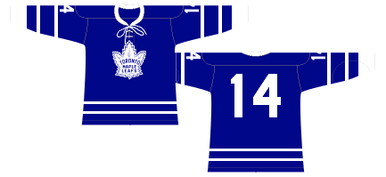
The Maple Leaf is an iconic symbol of our country, Toronto and our hockey club. We are proud to unveil a new logo as the team prepares to celebrate our Centennial season. The new Maple Leaf logo is inspired by the classic badge worn from the 1940's to 1960's.

Watch the Reveal

The Logo


The club's new mark has a number of distinguishing design characteristics:

Maple Leaf logo silhouette Maple Leaf logo veins top Maple Leaf logo veins bottom Maple Leaf logo type

31 Points


The new Maple Leaf has 31 points, a nod to the year 1931 and a defining moment in team history with the opening of Maple Leaf Gardens.

13 Veins at Top


13 veins at the top of the crest to commemorate the club's Stanley Cup Championships.

17 Vein Detail


The new badge contains a total of 17 veins, representing the year the franchise was founded.

Connection To Past


The new logo maintains a strong connection to the classic Leafs logo of the past while offering a fresh take on it for the future.

The Outline


The outline, seen in the most recent version of this Maple Leaf from 1963-67, has been removed to create a cleaner, bolder look.

Our New Uniform


Inspired by one hundred years of hockey
to forge a future for a new generation

Maple Leafs home jersey
Maple Leafs away jersey

"Conn Smythe spoke of his team wearing the Maple Leaf badge with ‘honour, pride and courage’ and those words are now stitched into the collar of each sweater so that our players, and fans, are reminded of that every time they put it on.”


- Brendan Shanahan

Our Logo Over The Years


1917-19

1920-27

1928-38

1939-62

1963-67

1967-70

1970-2016

Presented by

Presented by Ford